Hello everyone! I’ve talked about a possible guest post coming up… and here it is! Written by my awesome husband Mike, who is a talented graphic designer dedicated to making the world a more awesome place through arts and design. He’s compiled quite a few awesome things from the past weeks to share with you, hope you enjoy them as much as I do! :D
Â
 I’ve been following Lila Symon’s Daily Calligraphy blog for some time now. Her creative lettering and inspiring words are always clever and fun.
These paper roll portraits for Conqueror Paper by Anant Nanvare are simply breathtaking. (Speaking of Conquerer, they also commissioned a series of 5 typefaces by the ever skillful Jean Francois Porchez several years ago. Amazingly, the fonts are available for free.) via Inspire Me Now.
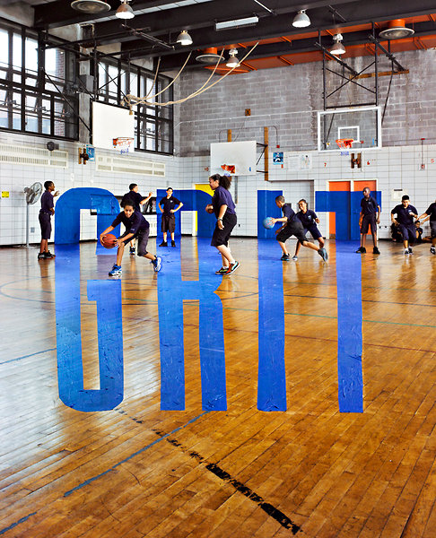
Doyle Partners used blue painters tape to create a larger than life cover for the New York Times magazine. The Times has a time-lapse video of the installation. via Quipsologies.
I just about fell out of my chair when I saw this. I never gave much thought to the shapes and colours of Apple’s text messaging app until now. Pure genius. How does this person not have friends? Originally posted on i am your canadian boyfriend.
Â
Â
This post from Fast Company was the one of the original reasons I wanted to do a guest post actually. I love everything about this. It’s bright, whimsical, and according to the article, has “a lovely fluidity to the piece, allowing it to move ever so slightly depending on movement nearby”. The structures are made from smaller ‘bricks’ constructed only out of post it notes. No glue was used in the making of these towers. More pictures here.
Â
Â
If towers aren’t your thing, you can always play Tetris with your sticky notes. via Quipsologies.
Â
Â
BlogTO (one of my favourite blogs) has a wonderful collection of old and new photo mashups of our fine city. It’s a shame there’s no pictures of the distillery district, a mashup of the working distillery of the past and today’s cafés and art galleries would have been fun. via BlogTO
Â
Â
Sage advice from Anna Jones of andthenshesaved.com. Anna’s blog chronicles how she went on a spending fast (and later a spending diet) and ultimately paid off $23,000 worth of debt. My favourite thing about her blog, other than all her fun pictures, is the fact that she’s not a very frugal person to begin with. Reading about her struggle to resist buying frivolous things gives me hope.
Â
Â
As you might have guessed, Trish and I are big Angry Birds fans. They’ve been adding a new mid-autumn festival — or mooncake festival as they call it — themed comics every day to their website. Awesome! via angrybirds.com
Â
Â
Lastly, since Pinterest is one of Trish’s favourite new websites, I thought I would link to a graphic design article on the creation of the Pinterest logotype. Just a glimpse into the effort that goes into seemingly simple branding projects. via The Case and Point.
Thanks for the opportunity to share some awesome finds with you all. Cheers!
 Mike


Trish! I love the iphone bit you posted. I also love the sound it makes whenever a message is received/sent! I do also wish there are photographs of distillry then+ now. let me know when you come across them!
good job mike! :D
the mashup pictures are so cool.….:) and the tetris sticky-notes is like something lud would like too~